表单(Form)
- 按需重绘,避免了不必要的全量渲染, 性能更高
- 简单易用,结构极简,避免了不必要的层级嵌套
- 完善的无障碍支持
- 在 Form 外部可方便地获取 formState / fieldState
提供在外部对表单内部进行操作的方法:formApi / fieldApi - 支持将自定义组件封装成表单控件,你可以通过 Form 提供的扩展机制(withField HOC)快捷接入自己团队的组件
- 支持 Form level / Field level 级别的赋值、校验(同步/异步)
表单控件(Field)
Semi 将所有自带的输入控件(文本输入框、下拉选择、复选框、单选框等)都使用 withField 封装了一次。 接管了他们的数据流(value & onChange)
使用的时候,需要从 Form 中导出(注意:从 Form 导出的控件才具有数据同步功能)
目前 Form 提供了如下表单控件
Input、InputNumber、TextArea、Select、Checkbox、Radio、RadioGroup、Switch、DatePicker、TimePicker、Slider、InputGroup、TreeSelect、Cascader、Rating、AutoComplete、Upload、Label、ErrorMessage、Section、TagInput都挂载在 Form 下,使用时直接以<Form.Input> 、<Form.Select>声明即可
import { Form } from '@kousum/semi-ui-vue';
// 具有数据同步功能的表单控件,在<Form></Form>内使用时,数据流会被Form自动接管
// 从Form中导出表单控件时,你还可以进行重命名(这里命名为FormInput仅仅是为了在以下示例中跟普通Input做区分)
const FormInput = Form.Input;
const FormSelect = Form.Select;
const Option = FormSelect.Option;
// 普通Input,在<Form></Form>内部使用时,Form不会对其做任何处理
import { Input } from '@kousum/semi-ui-vue';
Form 提供的 Field 级别组件,它的 value(或者 valueKey 指定的其他属性)、onChange(或 onKeyChangeFnName 指定的其他回调函数) 属性都会被 Form 劫持,所以
代码演示
声明表单的多种写法
Semi Form 同时支持多种写法
基本写法
从 Form 中导出表单控件,给表单控件添加field属性,将其放置于 Form 内部即可
还可以给每个表单控件设置label属性,不传入时默认与 field 相同label可以直接传入字符串,亦可以以 object 方式声明,配置 extra、required、optional等属性应对更复杂的场景
支持的其他写法
当你需要在 Form 结构内部直接获取到 formState、formApi、values 等值时,你还可以使用以下的写法
通过 render 属性传入
即 render props
通过 child render function
Form 的 children 是一个 function,return 出所有表单控件
通过 props.component
通过 component 属性直接将整个内部结构以 VNode 形式传入
已支持的表单控件
表单控件值的绑定
每个表单控件都需要以field属性绑定一个字段名称,用于将表单项的值正确映射到FormState values / errors / touched 中
字段可以是简单的字符串,可以是包含.或者[]的字符串, 支持多级嵌套
下面是字段名称以及他们在 FormState 中的映射路径的示例
| Field | Resolution |
|---|---|
| username | formState.values.username |
| user[0] | formState.values.user[0] |
| siblings.1 | formState.values.siblings[1] |
| siblings['2'] | formState.values.siblings[2] |
| parents[0].name | formState.values.parents[0].name |
| parents[1]['name'] | formState.values.parents[1].name |
表单布局
- 垂直布局:表单控件之间上下垂直排列(默认)
Semi Design 更推荐表单采用垂直布局
- 水平布局:表单控件之间水平排列 你可以通过设置
layout='horizontal'来使用水平布局
- labelPosition、labelAlign
你可以通过设置 labelPosition、labelAlign 控制 label 在 Field 中出现的位置,文本对齐的方向
- 更复杂的布局 你还可以结合 Grid 提供的 Row、Col,来对表单进行你想要的排列
表单分组
字段数量较多的表单应考虑对字段进行分组,可以使用Form.Section对 Fields 进行分组(仅影响布局,不会影响数据结构)
wrapperCol / labelCol
需要为 Form 内的所有 Field 设置统一的布局时,可以在 Form 上设置 wrapperCol 、labelCol 快速生成布局,无需手动使用 Row、Col 手动布局wrapperCol、labelCol属性配置参考Col 组件
隐藏Label
Form 会自动为 Field 控件插入 Label。如果你不需要自动插入 Label 模块, 可以通过在 Field 中设置noLabel=true将自动插入 Label 功能关闭(此时 Field 仍然具备自动展示 ErrorMessage 的能力,因此 DOM 结构与原始控件依然会有区别)
如果你希望与原始控件保持 DOM 结构一致,可以使用 pure=true,此时除了数据流被接管外,DOM结构不会有任何变化(你需要自行负责 ErrorMessage的渲染,同时它也无法被 formProps.wrapperCol 属性影响)
内嵌 Label
通过将 labelPosition 设为inset,可以将 Label 内嵌在表单控件中。目前支持这项功能的组件有Input、InputNumber、DatePicker、TimePicker、Select、TreeSelect、Cascader、TagInput
导出 Label、ErrorMessage 使用
如果你需要 Form.Label、Form.ErrorMessage 模块自行组合使用,可以从 Form 中导出
- Label 的 API 详见 Label
- ErrorMessage 的 API 详见 ErrorMessage
例如:当自带的 Label、ErrorMessage 布局不满足业务需求,需要自行组合位置,但又希望能直接使用 Label、ErrorMessage 的默认样式时
import { Form } from '@kousum/semi-ui-vue';
const { Label, ErrorMessage } = Form;
使用 Form.Slot 放置自定义组件
当你的自定义组件,需要与 Field 组件保持同样的布局样式时,你可以通过 Form.Slot 放置你的自定义组件
在 Form 组件上设置的 labelWidth、labelAlign、wrapperCol、labelCol 会自动作用在 Form.Slot 上
Slot 属性配置详见Form.Slot
使用 helpText、extraText 放置提示信息
可以通过helpText放置自定义提示信息,与校验信息(error)公用同一区块展示,两者均有值时,优先展示校验信息。
可以通过extraText放置额外的提示信息,当需要错误信息和提示文案同时出现时,可以使用这个配置,常显,位于 helpText/error 后
当传入 validateStatus 时,优先展示 validateStatus 值对应的 UI 样式。不传入时,以 field 内部校验状态为准。
通过配置 extraTextPosition,你可以控制 extraText 的显示位置。可选值 bottom、middle
例如如当你希望将 extraText 提示信息显示在 Label 与 Field 控件中间时
该属性可在 Form 上统一配置,亦可在每个 Field 上单独配置,同时传入时,以 Field 的配置为准。
使用 InputGroup 组合多个 Field
当你需要将一些表单控件组合起来使用时,你可以用Form.InputGroup将其包裹起来
当你给Select、Input等表单控件加上 field 属性时,Form会默认给每个 Field 控件自动插入Label
而在InputGroup中一般仅需要一个属于整个 Group 的 Label,你可以在 InputGroup 中设置 label 属性,插入一个属于 Group 的Labellabel可配置属性详见Label
Modal 弹出层中的表单
你可以将 Form 放置于 Modal 中,以弹窗形式承载
在提交时,通过 formApi.validate()对 Field 进行集中校验
配置初始值与校验规则
- 你可以通过
rules为每个 Field 表单控件配置校验规则
Form 内部的校验库基于 async-validator,更多配置规则可查阅其官方文档 - 你可以通过 form 的
initValues为整个表单统一设置初始值,也可以在每个 field 中通过initValue设置初始值(后者优先级更高) - 可以通过 trigger 为每个 Field 配置不同的校验触发时机,默认为 change(即onChange触发时,自动进行校验)。还支持 change、blur、mount、custom 或以上的组合。v2.42 后支持通过 FormProps 统一配置, 若都配置时,以 FieldProps 为准
- 可以通过 stopValidateWithError 开关,决定使用 rules 校验时,当碰到第一个检验不通过的 rules 后,是否继续触发后续 rules 的校验。v2.42 后支持通过 FormProps 统一配置,若都配置时,以 FieldProps 为准
自定义校验(Form 级别)
你可以给Form整体设置自定义校验函数 validateFields。submit 或调用formApi.validate()时会进行调用
同步校验
校验通过时,你应该返回一个空字符串;
校验失败时,你应该返回错误信息(Object,key 为 fieldName,value 为对应的错误信息)
异步校验
异步校验时,你应当返回一个 promise,在 promise.then()中 你需要 return 对应的错误信息
自定义校验(Field 级别)
你可以指定单个表单控件的自定义校验函数,支持同步、异步校验(通过返回 promise)
手动触发指定 Field 校验
当你希望手动触发某些特定 Field 的校验操作时,可以通过 formApi.validate 完成。不传入参数时,默认对全部 Field 进行校验,传入参数时,以参数指定为准
表单联动
你可以通过监听 Field 的 onChange 事件,然后使用 formApi 进行相关修改,来使 Field 之间达到联动
动态表单
动态删减表单项
使用 ArrayField
针对动态增删的数组类表单项,我们提供了 ArrayField 作用域来简化 add/remove 的操作
ArrayField 自带了 add、remove、addWithInitValue 等 api 用来执行新增行,删除行,新增带有初始值的行等操作
ArrayField 详细的 API请查阅下方 ArrayField Props 注意:ArrayField 的 initValue 类型必须是数组
嵌套 ArrayField
ArrayField 支持多级嵌套,如下是一个两级嵌套的例子
Hooks 的使用
我们提供了四个 Hooks,使你在不需要通过 props 传递的情况下,也能在放置于 Form 结构内部的 Functional Component 中也能轻易访问到 Form 内部状态数据,以及调用 Form、Field 的相关 api
import { useFormApi, useFormState, useFieldApi, useFieldState } from '@kousum/semi-ui-vue';useFormApi
useFormApi 允许你通过 hook,在 Functional Component 内直接访问父级 Form 组件的 formApi
useFormState
useFormState 允许你通过 hook,在 Functional Component 内直接访问父级 Form 组件的 formState
useFieldApi
useFieldApi 允许你通过 hook,在 Functional Component 内直接调用指定 Field 的 api
useFieldState
useFieldState 允许你通过 hook,在 Functional Component 内直接访问指定 Field 的 State
HOC 的使用
我们提供了两个 HOC: withFormApi、withFormState,可以在其他组件内部访问到 Form 的 formApi 以及内部状态 formState 提供了 HOC: withField,用于将自定义组件封装成符合 Semi Form 数据流的表单控件
import { withFormApi, withFormState, withField } from '@kousum/semi-ui-vue';HOC-withFormApi
你可以通过 withFormApi HOC 来封装组件,使得该组件内部可以直接调用父级 Form 组件的 formApi
注意封装后的组件必须放置于 Form 结构内部
HOC-withFormState
你可以通过 withFormState HOC 来封装组件,使得该组件内部可直接访问到父级 Form 组件的 FormState
注意封装后的组件必须放置于 Form 结构内部 (因其强依赖 Context 机制进行消费)
withField 封装自定义表单控件
通过 withField,你可以将其他自定义组件扩展成为表单控件,由 Form 接管其行为
withField 主要做了以下事情
- 负责接管组件的 value(或者 valueKey 指定的其他属性)、onChange(或 onKeyChangeFnName 指定的其他回调函数)
- 负责在表单控件上方插入 Field 的
<Form.Label> - 负责在表单控件下方插入 Field 的
<ErrorMessage> - 负责在表单控件下方插入 Field 的 extraText
withFieldOption 具体配置可参考 withField Option
你的自定义受控组件需要做以下事情:
- 值发生变化时,调用props.onChange (或 onKeyChangeFnName 指定的其他回调函数) 并且将最新的值作为入参
- 响应props.value(或者 valueKey 指定的其他属性)的变化,并更新你的组件UI渲染结果
withField(YourComponent, withFieldOption);API 参考
Form Props
| 属性 | 说明 | 类型 | 默认值 |
|---|---|---|---|
| autoScrollToError | 若为 true,submit 或者调用 formApi.validate()校验失败时,将会自动滚动至出错的字段。object 型配置参考options | boolean| object | false |
| allowEmpty | 是否保留values中为空值的field的key,true时保留key,false时移除key | boolean | false |
| className | form 标签的 classname | string | |
| component | 用于声明表单控件,不可与 render、props.children 同时使用 | VNode | |
| disabled | 统一应用在每个 Field 的 disabled 属性 | boolean | false |
| extraTextPosition | 统一应用在每个 Field 上的extraTextPosition属性,控制extraText的显示位置,可选middle(垂直方向以Label、extraText、Field主体的顺序显示)、bottom (垂直方向以Label、Field主体、extraText的顺序显示) 在 v1.9.0 开始提供 | string | 'bottom' |
| getFormApi | form mounted 时会回调该函数,将 formAPI 作为参数传入。formApi 可用于修改 form 内部状态(值、校验状态、错误信息) | function(formApi:object) | |
| initValues | 用于统一设置表单初始值(仅会在组件挂载时消费一次),例如{fieldA:'hello', fieldB:['arr1', 'arr2']} | object | |
| layout | Form 表单控件间的布局,目前支持水平(horizontal)、垂直(vertical)两种 | string | 'vertical' |
| labelAlign | 统一配置label 的 text-align 值 | string | 'left' |
| labelCol | 统一应用在每个 Field 的 label 标签布局,同Col 组件,设置span、offset值,如{span: 6, offset: 2} | object | |
| labelPosition | 统一配置Field 中 label 的位置,可选'top'、'left'、'inset'(inset 标签内嵌仅部分组件支持) | string | 'top' |
| labelWidth | 统一配置label 宽度 | string|number | |
| onChange | form 更新时触发,包括表单控件挂载/卸载/值变更/blur/验证状态变更/错误提示变更, 入参为 formState | function(formState:object) | |
| onValueChange | form 的值被更新时触发,仅在表单控件值发生变化时触发。第一个入参为 formState.values,第二个入参为当前发生变化的 field | function(values:object, changedValue: object) | |
| onReset | 点击 reset 按钮或调用 formApi.reset()时的回调函数 | function() | |
| onSubmit | 点击 submit 按钮或调用 formApi.submitForm(),数据验证成功后的回调函数 | function(values:object, e: event) | |
| onSubmitFail | 点击 submit 按钮或调用 formApi.submitForm(),数据验证失败后的回调函数 | function(errors:object, values:object, e: event) | |
| render | 用于声明表单控件,不可与 component、props.children 同时使用 | function | |
| showValidateIcon | Field 内的校验信息区块否自动添加对应状态的 icon 展示 | boolean | true |
| style | 可将内联样式传入 form 标签 | object | |
| stopValidateWithError | 统一应用在每个 Field 的 stopValidateWithError,使用说明见 Field props中同名 API (v2.42后提供) | boolean | false |
| trigger | 统一应用在每个 Field 的 trigger,使用说明详见 Field props中同名 API(v2.42后提供) | string|array | 'change' |
| validateFields | Form 级别的自定义校验函数,submit 时或 formApi.validate 时会被调用(配置Form级别校验器后,Field级别校验器在submit或formApi.validate()时不会再被触发)。支持同步校验、异步校验 | function(values) | |
| wrapperCol | 统一应用在每个 Field 上的布局,同Col 组件,设置span、offset值,如{span: 20, offset: 4} | object |
FormState
FormState 存储了所有 Form 内部的状态值,包括各表单控件的值,错误信息、touched 状态
进行表单提交时,实际提交的就是 formState.values
| Name | 说明 | 初始值 | 示例 |
|---|---|---|---|
| values | 表单的值 | {} | { fieldA: 'str', fieldB: true } |
| errors | 表单错误信息集合,你可以通过判断是否有错误信息来决定是否允许用户提交 | {} | { fieldA: 'length not valid'} |
| touched | 用户点击过的 field 集合 | {} | { fieldA: true } |
如何访问 formState
- 通过调用 formApi.getFormState(),在 Form 外部也可以获取 formState
- 通过 child render function 方式声明表单,formState 会作为参数注入
- 通过 render props 方式声明表单,formState 会作为参数注入
- 通过 useFormState hook,Functional Component 访问父级 Form 的 formState,无需繁琐的引用传递
- 通过 withFormState HOC
FormApi
我们提供了 FormApi。你在 Form 内部、外部都可以很方便地获取到 formApi,它允许你使用 getter 和 setter 来获取和操作 formState 的值。
下面的表格描述了 formApi 中可用的功能。
| Function | 说明 | example |
|---|---|---|
| getFormProps | 获取 Form 组件上当前所有props的值,例如可用于读取 disabled 等。v 2.57.0 后提供 | formApi.getProps(propNames?: string[]) |
| getFormState | 获取 FormState | formApi.getFormState() |
| submitForm | 可手动触发 submit 提交操作 | formApi.submitForm() |
| reset | 可手动对 form 进行重置 | formApi.reset(fields?: Array <string>) |
| validate | 可手动触发对表单的校验,不传参时默认触发整全体Field的校验(配置Form级别校验器后,Field级别校验器在submit或formApi.validate()时不会再被触发),若想触发部分field的校验,将目标field数组传入即可 | formApi.validate() .then(values=>{}) .catch(errors=>{}) 或 formApi.validate(['fieldA','fieldB']) |
| setValues | 设置整个表单的值。第二个参数中的 isOverride 默认为 false 默认情况下只会从 newValues中取 Form 中已存在的 field 的值更新到formState.values中。当 isOverride 为 true时,会直接以 newValues 覆盖赋值给 formState.values | formApi.setValues(newValues: object, { isOverride: boolean }) |
| setValue | 提供直接修改 formState.values 方法,与 setValues 的区别是它仅修改单个 field | formApi.setValue(field: string, newFieldValue: any) |
| getValue | 获取 单个 Field 的值 | formApi.getValue() formApi.getValue(field: string) |
| getValues | 获取 所有 Field 的值 | formApi.getValues() |
| setTouched | 修改 formState.touched | formApi.setTouched(field: string, isTouched: boolean) |
| getTouched | 获取 Field 的 touched 状态 | formApi.getTouched(field: string) |
| setError | 修改 某个 field 的 error 信息 | formApi.setError(field: string, fieldErrorMessage: string) |
| getError | 获取 Field 的 error 状态 | formApi.getError(field: string) |
| getFieldExist | 获取 Form 中是否存在对应的 field | formApi.getFieldExist(field: string) |
| scrollToField | 滚动至指定的 field, 第二个入参将透传至scroll-into-view-if-needed | formApi.scrollToField(field: string, scrollOpts: ScrollIntoViewOptions) |
| scrollToError | 滚动至校验错误的field,可传指定 field 或者 index,传入 index 则滚动到第 index 个错误的 DOM,若不传参则滚动到DOM树中第一个校验出错的位置。 v2.61.0后提供 | formApi.scrollToError( ScrollToErrorOptions |
如何获取 formApi
- Form 组件在 ComponentDidMount 阶段,会执行 props 传入的 getFormApi 回调,你可以在回调函数中保存 formApi 的引用,以便后续进行调用(示例如下代码)
除此之外,我们还提供了其他方式获取 formApi,你可以根据喜好选择不同的调用方式 - 通过 ref 的方式获取 Form 组件实例,直接访问实例上的 formApi
- 通过 child render function 方式声明表单,formApi 会作为参数注入
- 通过 render props 方式声明表单,formApi 会作为参数注入
- 通过 useFormApi hook
- 通过 withFormApi HOC
import { Form, Button } from '@kousum/semi-ui-vue';
import { defineComponent, shallowRef } from 'vue';

export const Comp = defineComponent(() => {
  // 函数式组件通过useRef存储formApi
  const api = shallowRef();

  return ()=>(
    <Form getFormApi={formApi => api.value = formApi}>
      <Form.Input field='a' />
      <Button onClick={()=>{console.log(api);}}>log</Button>
    </Form>
  );
});
import { Form, Button } from '@kousum/semi-ui-vue';
import { shallowRef, defineComponent } from 'vue';

export const Comp = defineComponent(() => {
  const formBRef = shallowRef();
  const formApi = shallowRef();


  function getFormApi(formApi) {
    formApi.value = formApi;
    // 获取到formApi对象后,你可以使用它来对表单进行任何你想做的修改 ~
  }

  function changeValues() {
    // 使用 FormA的 formApi
    formApi.value.setValues({ a: 1 });
    // 使用 FormB的 formApi
    formBRef.value.formApi.setValues({ b: 2 });
  }

  return () => {
    return (
      <>
        {/* 通过getFormApi回调获取并保存formApi */}
        <Form getFormApi={getFormApi} />
        {/* 通过ref直接获取Form组件实例上的formApi */}
        <Form ref={formBRef} />
        <Button onClick={() => changeValues()}>Change</Button>
      </>
    );
  }
})
Field Props
v1.30后可直接通过ref获取底层控件实例,例如给Form.Input、Form.Select指定ref,直接获取到底层原始Input、Select组件的ref引用
| 属性 | 说明 | 类型 | 默认值 |
|---|---|---|---|
| convert | field 值改变后,在 rerender 前,对 filed 的值进行二次更新 使用示例: (value) => newValue | function(fieldValue) | |
| field | 该表单控件的值在 formState.values 中的映射路径,Form 会使用该值来区分内部的表单控件 必填!!! 示例:Bindding Syntax | string | |
| label | 该表单控件的 label 标签文本,不传的时候默认与 field 同名, 传入 object 时会将其透传给 Form.Label,具体配置请参考Label | string|object | |
| labelPosition | 该表单控件的 label 位置,可选'top'/'left'/'inset'。在Form与Field上同时传入时,以Field props为准 | string | |
| labelAlign | 该表单控件的 label 文本的 text-align。在Form与Field上同时传入时,以Field props为准 | string | |
| labelWidth | 该表单控件的 label 文本的 width。在Form与Field上同时传入时,以Field props为准 | string|number | |
| noLabel | 当你不需要自动添加 label 时,可以将该值置为 true | boolean | |
| noErrorMessage | 当你不需要自动添加 ErrorMessage 模块时,可以将该值置为 true,注意此时 helpText 也不会被展示 | boolean | |
| name | 控件名称,传入时会自动在对应 field wrapper div 追加对应的 className,如:abc => '.semi-form-field-abc'。 v2.24 后,还会将 name 透传至底层组件消费,例如你可以用于配置 input的name属性 | string | |
| fieldClassName | 整个 fieldWrapper 的 className,作用与 name 参数一致,区别是不会自动追加前缀 | string | |
| fieldStyle | 整个 fieldWrapper 的 内联样式 v1.15.0开始提供 | object | |
| initValue | 该表单控件的初始值(仅在 Field mounted 时消费一次,后续更新无效),相比 Form 的 initValues 中的值,它的优先级更高 | any(类型取决于当前组件,详细见各组件的 api) | |
| validate | 该表单控件的的自定义校验函数。支持同步、异步校验(通过返回promise)。 设置了 validate 时,rules 不会生效 使用示例:(fieldValue, values) => fieldValue >= 5 ? 'value not valid': '' | function(fieldValue, values) | |
| rules | 校验规则,校验库基于async-validator 使用示例:const rules=[{ required: true, message: 'can't be null ' }, { max: 10, message: 'can't more than 10 word' }] | array | |
| validateStatus | 该表单控件的校验结果状态(仅影响样式),可选值:success/error/warning/default | string | 'default' |
| trigger | 触发校验的时机,可选值:blur/change/custom/mount,或以上值的组合['blur','change']1、设置为 custom 时,仅会由 formApi/fieldApi 触发校验时被触发 2、mount(挂载时即触发一次校验) | string/array | 'change' |
| onChange | 值变化时触发的回调 | function(filedValue: any | ev: { target: { value: any }}) (具体参见各组件的 onChange 方法) | |
| onBlur | 失去焦点时触发的回调 | function() (具体参见各组件的 onBlur 方法) | |
| transform | 校验前转换字段值,转换后的值仅会在校验时被消费,对 formState 无影响 使用示例: (value) => Number | function(fieldValue) | |
| allowEmptyString | 是否允许值为空字符串。默认情况下值为''时,该 field 对应的 key 会从 values 中移除,如果你希望保留该 key,那么需要将 allowEmptyString 设为 true | boolean | false |
| stopValidateWithError | 为 true 时,使用 rules 校验,碰到第一个检验不通过的 rules 后,将不再触发后续 rules 的校验 | boolean | false |
| helpText | 自定义提示信息,与校验信息公用同一区块展示,两者均有值时,优先展示校验信息 | VNode | |
| extraText | 额外的提示信息,当需要错误信息和提示文案同时出现时,可以使用这个,位于 helpText/errorMessage 后 | VNode | |
| pure | 是否仅接管数据流,为 true 时不会自动插入 ErrorMessage、Label、extraText 等模块,样式、DOM 结构与原始的组件保持一致 | boolean | false |
| extraTextPosition | 控制extraText的显示位置,可选middle(垂直方向以Label、extraText、Field主体的顺序显示)、bottom (垂直方向以Label、Field主体、extraText的顺序显示);在Form与Field上同时传入时,以Field props为准 | string | 'bottom' |
| ...other | 组件的其他可配置属性,与上面的属性平级一并传入即可,例如 Input 的 size/placeholder,Field 会将其透传至组件本身 |
ArrayField Props
针对动态增删的数组类表单项,我们提供了 ArrayField 作用域来简化 add/remove 的操作
| 属性 | 说明 | 类型 | 默认值 |
|---|---|---|---|
| field | 该表单控件的值在 formState.values 中的映射路径 必填,例如存在 ArrayField负责 a[0].name、a[1].name、a[2].name三行渲染,他们的父级为a,此处props.field应为 a | string | |
| initValue | ArrayField的初始值,如果同时在 formProps.initValues 与 arrayFieldProps.initValue 中都配置了初始值,后者优先级更高 | Array | [] |
| children | ArrayField的内容,类型为 Function,函数入参为 add、addWithInitValue 等操作函数 及 arrayFields,执行后应当返回 VNode | Function(ArrayFieldChildrenProps) => VNode |
interface ArrayFieldChildrenProps {
    arrayFields: ArrayFieldItem<>;                               // 当前数组表单,可以用来执行map操作渲染出每一行
    add: () => void;                                             // 新增空白行
    addWithInitValue: (lineObject: Record<string, any>) => void; // 新增一个带初始值的行
}

interface ArrayFieldItem {
    key: string;        // 一个用于标识当前行的key,应当绑定在当前行的 wrapper 上
    field: string;      // 本行 fieldPath, 它等同于 ArrayFieldProps.field + [index]
    remove: () => void; // 移除本行的操作函数,调用时将直接删除本行
}
Form.Section
import { Form } from '@kousum/semi-ui-vue';
const { Section } = Form;| 属性 | 说明 | 类型 | 版本 |
|---|---|---|---|
| text | 段落标题 | VNode | v1.0.0 |
| className | 样式类名 | string | v1.0.0 |
| style | 内联样式 | object | v1.0.0 |
| children | 段落内容 | VNode | v1.0.0 |
Form.Label
默认情况下,Label 会由 Form 自行插入到每个 Field 中。如果你需要在其他地方自行插入 Label,我们提供了 Label 组件可以导出
import { Form } from '@kousum/semi-ui-vue';
const { Label } = Form;| 属性 | 说明 | 类型 | 默认值 | 版本 |
|---|---|---|---|---|
| text | Label 内容 | VNode | ||
| required | 是否展示必填的*号 | boolean | false | |
| extra | 跟随在 required 后的内容 | VNode | v0.33.0 | |
| align | text-align | string | 'left' | |
| className | 样式类名 | string | ||
| style | 内联样式 | string | ||
| width | label 宽度 | number/string | ||
| optional | 是否自动在text后追加"(可选)"文字标识(根据Locale配置的不同语言自动切换相同语义文本)。当该项为true时,required的*号将不再展示。若当表单项多数均为必填时,仅强调可选项会更使得整体视觉更简洁 | boolean | false | v2.18.0 |
Form.InputGroup
| 属性 | 说明 | 类型 | 默认值 | 版本 |
|---|---|---|---|---|
| className | 样式类名 | string | ||
| style | 内联样式 | object | ||
| label | InputGroup 的 label 标签文本 | Label | string | ||
| labelPosition | 该表单控件的 label 位置,可选'top'/'left'/'inset'。在 Form 与 InputGroup 同时传入时,以 InputGroup props为准 | string | 'top' | |
| extraText | 额外的提示信息,当需要错误信息和提示文案同时出现时,可以使用这个,位于 errorMessage 后 | VNode | v2.29.0 | |
| extraTextPosition | 控制extraText的显示位置,可选middle(垂直方向以Label、extraText、Group的顺序显示)、bottom (垂直方向以Label、Group、extraText的顺序显示) | string | 'bottom' | v2.29.0 |
当 extraTextPositon 为 middle,且 labelPosition 为 left时。由于 extraText允许为 VNode,内容高度不定,Label将不再确保能与 Field / InputGroup 中的首行文本对齐。
Form.Slot
import { Form } from '@kousum/semi-ui-vue';
const { Slot } = Form;| 属性 | 说明 | 类型 |
|---|---|---|
| label | slot 的Label 配置, 例如{ text: 'semi', align: 'left' };也可以直接传入 string,Slot 内部会自动封装成合法 Label 格式 | object|string |
| labelPosition | slot 的 label 位置,默认情况下继承自 Form props,也可单独覆盖。可选'top'、'left' | string |
| className | slot 样式类名 | string |
| style | slot 内联样式 | object |
| children | slot 的主体内容 | VNode |
| error | slot 的错误提示信息 | ErrorMessage|VNode |
Form.ErrorMessage
import { Form } from '@kousum/semi-ui-vue';
const { ErrorMessage } = Form;- 当 error 为 VNode、String、Boolean 时,直接渲染
- 当 error 为数组时,会自动执行 join 操作聚合数组内的错误信息
| 属性 | 说明 | 类型 |
|---|---|---|
| error | 错误信息内容 | string|array|VNode|boolean |
| className | 样式类名 | string |
| style | 内联样式 | object |
| showValidateIcon | 是否自动加上 validateStatus 对应的 icon | boolean |
| validateStatus | 信息所属的校验状态,可选 default/error/warning/success(success一般建议与default样式相同) | string |
withFieldOption
| key | 描述 | 默认值 |
|---|---|---|
| valueKey | 组件表示值的属性,如 Switch、Radio 的是'checked',Input 的是'value' | 'value' |
| onKeyChangeFnName | 组件值变化时的回调函数,一般为'onChange' | 'onChange' |
| valuePath | 值属性在回调函数中第一个参数的路径,如 Radio 的 onChange(e.target.checked),那么该值需要设为 target.checkd;RadioGroup 的 onChange(e.target.value),该值为'target.value';若第一个参数就是值本身,无需再往下取值,该项不需要设 |
Accessibility
ARIA
- aria-labelledby、for
- Field 组件,会自动添加 label DOM。label 的
for属性与props.id或props.name或props.field相同 ;label 的id 属性由props.id或props.name或props.field决定,值格式为${props.field}-label; - 当 Form 或者 Field 的 props.labelPosition 设置为 inset时,此时不存在 label 标签,而是 div 标签。insetLabel 对应的 div 标签会被自动追加 id,值与上述 label 的 id 相同,对应 Field 组件的
aria-labelledby - Field 组件会被自动追加
aria-labelledby,值与上述 label 的id 相同
- Field 组件,会自动添加 label DOM。label 的
- aria-required
- 当 Field 配置了必填时(即 props.rules中包含 require: true 或 props.label配置了required: true),Field 组件会被自动追加 aria-required = true(Form.Switch、Form.CheckboxGroup 除外)
- aria-invalid 、aria-errormessage
- 当 Field 校验未通过时,Field 组件会被自动添加
aria-invalid= true 属性,Form.CheckboxGroup 除外。 - 当 Field 校验未通过时,Field 组件会被自动追加
aria-errormessage属性,值为 errorMessage 所对应DOM元素的 id (格式:${props.field}-errormessage),Form.CheckboxGroup 除外。
- 当 Field 校验未通过时,Field 组件会被自动添加
- aria-describedby
- 当 Field 配置了
helpText或extraText时,Field 组件会被自动添加aria-describedby属性,值为 helpText、extraText 所对应DOM元素的 id (格式:${props.field}-helpText、${props.field}-extraText)
- 当 Field 配置了
文案规范
- 表单标题
- 表单标题需要跟随标题的书写规范
- 表单标签
- 标签是输入框的简短描述。标签不是注释信息(help text),因此不应该是输入框的填写说明
- 标签必须要:
- 放在输入框的上方或下方
- 简短(1-3个词)
- 使用语句的大小写规范(首字母大写,其他小写)
- 帮助文本
- 帮助文本使用语句书写规范,首字母大写
- 表单按钮
- 关于表单按钮的文案规范,参考按钮Button组件的文案规范
| ✅ 推荐用法 | ❌ 不推荐用法 |
|---|---|
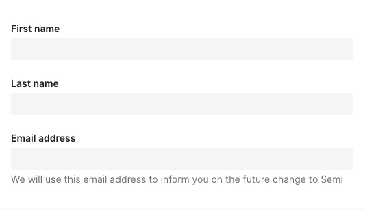 | 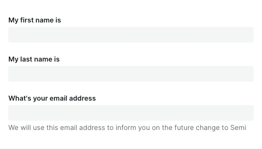 |
设计变量
FAQ
为什么我声明了表单,对值进行了修改,数据没有自动映射到 formState.values 中?
请检查是否正确传入了 field,Field 上的field属性是必填项!!!为什么传入了 defaultValue、defaultChecked 不生效?
请参考文档开头表单控件,Form.Field 组件对默认值做了统一处理,你应该使用initValue或者initValues来传入默认值为什么异步更新了 initValue、initValues 后,组件没有发生变化,值没有生效?
initValue、initValues只在 Field、Form mounted 时进行消费,后续做的异步更新并不会起效。
如果你的初始值需要从远程取,那么你可以在获取到值之后,使用formApi.setValue/setValues进行更新。
或者直接给 Form、Field 传入一个新的key强制它重新挂载为什么调用了 formApi.setValues 更新 fields 的值,但是实际渲染并没有更新?
setValues 默认情况下对尚未存在的 field 进行赋值不会生效。如果你的 fields 是动态加载的话,请检查在 setValues 时,该 field 是否已 mounted。
如有需要,可以使用 override 模式formApi.setValues(newValue, { isOverride: true })为什么 rules 中的 validator 校验失败,但是对应的错误信息没有被展示?
async-validator 的自定义 validator 返回值必须是 boolean 类型,否则它不执行任何回调,semi 后续的钩子也不会被调用。建议通过加 !! 或者 Boolean() 强制转换返回类型
为什么 getValues 拿不到某个 field?
field 没有初始值的话,
getValues获取不到这一项。可以设置initValues/initValue或者给 form 设置allowEmpty属性。为什么在输入框(Input、TagInput……)上敲击 enter 回车键会触发了 Form 的 submit?
这个是标准 HTML 行为,我们不计划进行干预,会与原生保持一致。如果表单内确实只有一个 Input 元素,又不想回车时触发 submit 回调,建议对 Input 的 keydown 事件的 enter 采取 preventDefault 阻止默认行为。
点击 #767 查看相关背景和内容。
表单会自动保存历史输入项,不想要这个功能怎么办?
在 v2.3 之前,Form 并没有严格按照 A11y 无障碍标准为输入控件配置for、name、id等属性,因此在之前的版本并没有该功能。v2.3 后我们严格按照 W3C 标准进行了实现。如果你不希望浏览器自动保存历史输入项,也可以通过在 Form 级别或者 Field 级别设置autoComplete=off关掉